Part -3 Crafting a Smooth Checkout Journey: Ecommerce Web Design Tactics for Success
Welcome back to our series on making your online shop the best it can be. We started with Part 1, where we showed you how to make your product pages interesting and inviting. Then, in Part 2, we talked about how to organize your category pages so customers can find what they need easily.
Now, we’re at Part 3, all about the checkout page — the last step where customers buy your products. Here, we’ll share simple tips to make paying easy, quick, and hassle-free. If you’ve followed our advice so far, this part will help make sure more customers finish buying once they’ve started. Let’s make sure they cross the finish line!
1. The importance of a seamless checkout experience in e-commerce
2. Common challenges in the e-commerce checkout process
3. Key elements of a user-friendly checkout page
4. Optimizing the checkout flow for mobile users
5. Strategies for reducing cart abandonment rates
6. Building trust and security in the checkout process
7. Tools and plugins to improve the checkout experience
8. Testing and optimizing your checkout process
9. Conclusion: The impact of a seamless checkout on ecommerce success
1. The importance of a seamless checkout experience in e-commerce
As an e-commerce business owner, you know how crucial a smooth checkout process is for your customers. Making sure they can pay easily and quickly means they’re more likely to actually buy what’s in their carts.
This isn’t just about making things nicer for your customers; it’s about your bottom line. A seamless checkout can lead to more sales, fewer people leaving before buying and building a trusting relationship with your shoppers.
Why is this last step so important? It’s the make-or-break moment when shoppers decide to go through with their purchase or give up. Statistics show that a complicated or slow checkout can push as many as 70% of customers away.
That’s a lot of lost sales! But if they can check out with just a few clicks, up to 60% are more likely to come back and buy again. So, a simple, clear checkout isn’t just about one sale—it’s about turning a shopper into a repeat customer.
2. Common challenges in the e-commerce checkout process
Lengthy Checkout Forms:
- Customers are often put off by long and complex forms.
- Streamline the process by requesting only essential information.
- Implement autofill to speed up the process.
Unexpected Costs:
- Shoppers dislike being surprised by additional fees at checkout.
- Be transparent about all costs from the start.
- Use shipping calculators to provide cost estimates early on.
Technical Issues:
- Slow load times and errors can drive customers away.
- Regular testing is crucial to keep the checkout running smoothly.
- Address and fix any technical glitches quickly to maintain trust.
3. Key elements of a user-friendly checkout page
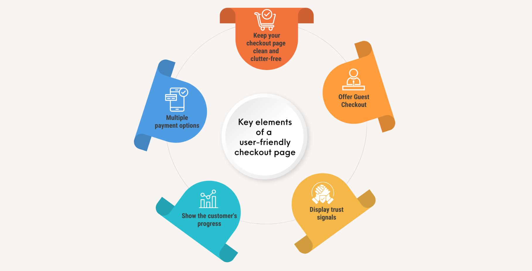
Simplified Layout:
- Use a clean, intuitive design.
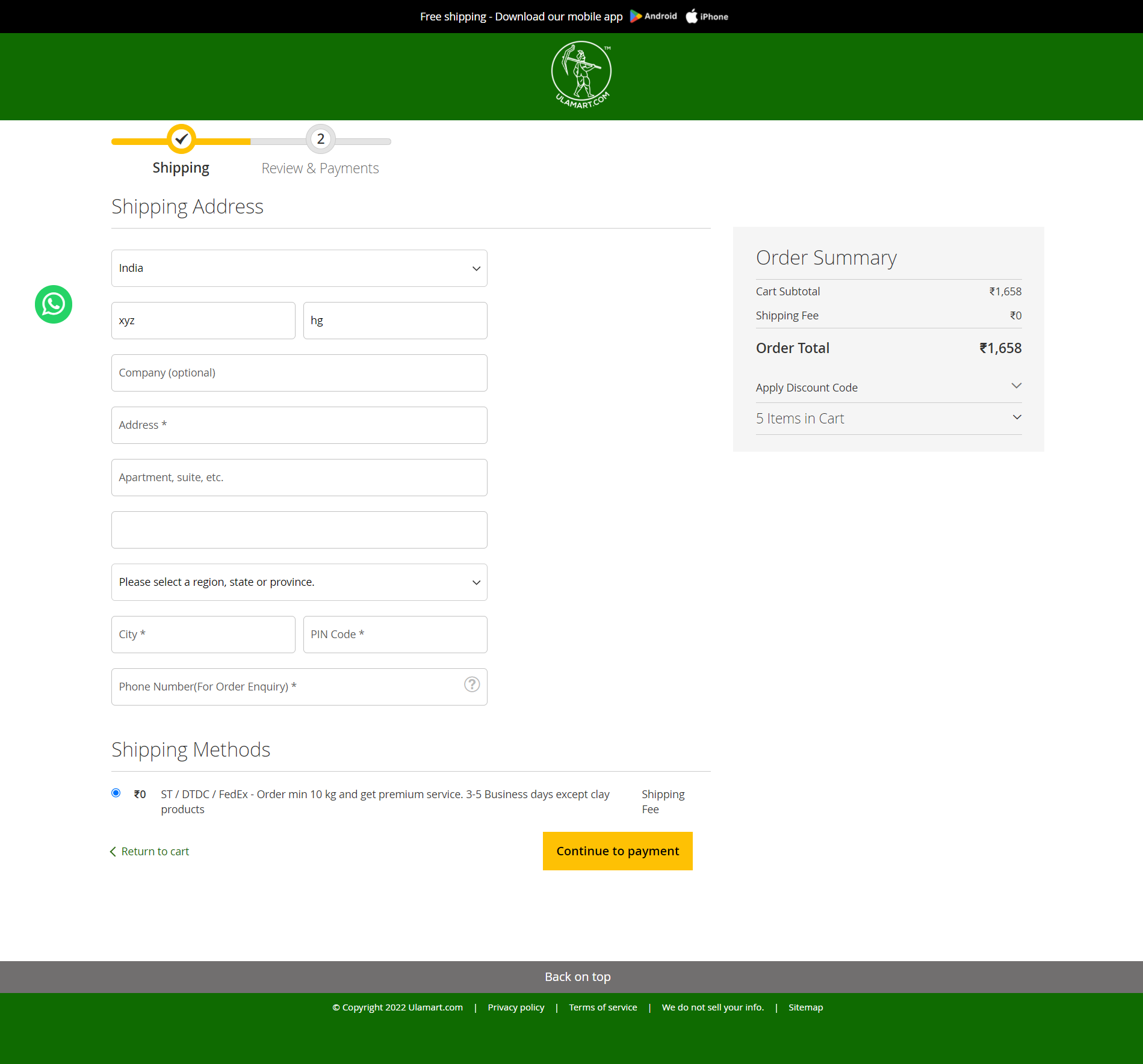
- Provide clear instructions and a step-by-step process.
Multiple Payment Options:
- Include popular gateways like PayPal and Razorpay.
- Cater to various customer preferences.
Guest Checkout Option:
- Allow customers to buy without creating an account.
- Offer a quicker, hassle-free purchasing experience.
Progress Indicators:
- Clearly show customers how many steps are left.
- Use indicators to guide and reassure users through the process.
One-Page Checkout:
- Enable customers to complete purchases on a single page.
- Streamline the process to reduce cart abandonment.
Guest Checkout Benefits:
- Enhance privacy and trust by not requiring account registration.
- Simplify the purchasing process, saving time and effort.
4. Optimizing the checkout flow for mobile users
Shoppers on phones and tablets need a checkout that’s easy to use. That’s why it’s important to have a checkout page that looks good and works well on all screen sizes.
Make sure your checkout changes shape to fit any screen, so it’s always easy for customers to use.
Also, think about adding quick payment options like digital wallets and QR codes. These make buying things on a phone super simple.
With mobile commerce on the rise, as demonstrated by the predominance of mobile transactions on ulmart.com, optimizing for mobile-friendly checkout experiences is indispensable.
5. Strategies for reducing cart abandonment rates

People sometimes put items in their online shopping cart but don’t end up buying them. This is called cart abandonment.
A good way to help with this is to let people check out without making an account. This makes buying things quicker and easier, so more people might finish buying what they’ve picked out.
You can also send emails to remind people about what they’ve left in their cart. Add a little something extra, like a small discount or free shipping, to tempt them back to buy it.
Another tip is to make the checkout really simple. Fewer steps and questions mean people are more likely to go through with their purchase.
6. Building trust and security in the checkout process
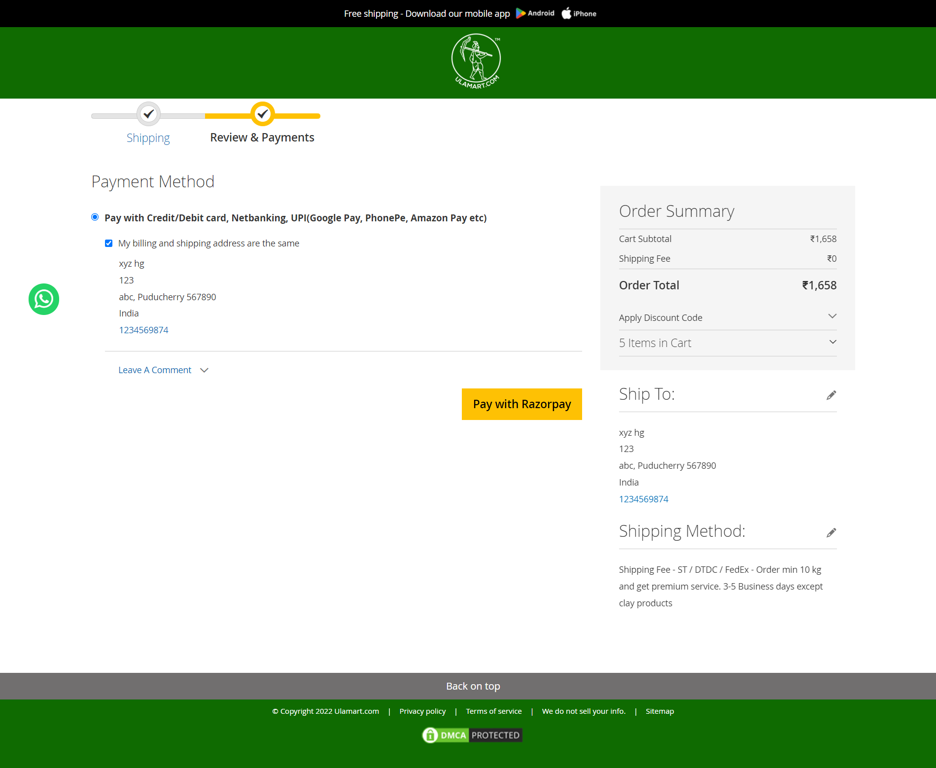
Building trust and security in the checkout process is crucial to reassure customers and increase conversions.
Display Security Indicators
Building trust can be as simple as showing clear signs of security, like trust seals, security badges, or SSL certificates, on your payment page. These symbols tell your customers that their personal and payment information is safe and will be handled securely.
Secure Payment Options
“Additionally, providing safe ways to pay, like secure credit card processing or well-known payment services, can make your checkout seem more trustworthy. People are more willing to buy when they feel confident that their payment details are protected.
Transparent Refund and Return Policies
Finally, having straightforward and open policies for refunds and returns can increase your customers’ confidence. Make sure to explain your policies well, including any deadlines or special conditions, so customers feel comfortable knowing they can return or exchange their items if they need to.
7. Tools and plugins to improve the checkout experience
There are numerous tools and plugins available that can help improve the checkout experience for your ecommerce website. One popular tool is Boomimart, an all-in-one ecommerce platform.
Boomimart provides a seamless and straightforward checkout process, along with built-in payment gateways and shipping options. It also offers a wide range of plugins and integrations to further improve the checkout experience.
Additionally, consider using tools such as Google Analytics to track and analyze user behavior during the checkout process. These tools can provide valuable insights into customer preferences, pain points, and areas for improvement.
8. Testing and optimizing your checkout process
Using A/B testing, you can try out two different styles of your checkout page to see which one works best. This means you can change things like the design, colors, where buttons go, or what information you ask for. Then, you can see which version customers like more, using real data to make your checkout page the best it can be.
Regularly checking and studying your checkout data is important to spot any problems or spots that could be better. Keep an eye on things like how often people leave items in their cart without buying, how often visits turn into sales, and how much people spend on average.
By keeping a regular check on these numbers, you’ll be able to notice patterns, catch any problems, and make informed changes to better your checkout procedure.
9. Conclusion: The impact of a seamless checkout on ecommerce success
A seamless checkout is key to e-commerce success. Simplify the process, offer various payment methods, and ensure clarity on progress to keep customers engaged. Cater to mobile users, address cart abandonment proactively, and prioritize trust and security to boost conversions and foster loyalty. Continual optimization based on testing and best practices will enhance the shopping experience and propel business growth.
